---
title: "Churn Prediction with Tidymodels - Part 1: K-Nearest Neighbors"
author: Ceren Unal
categories: [classification, exploratory data analysis]
image: image-woman-watching-tv.png
description: The first part of the Churn Prediction project explores the customer data set and builds a baseline model using the K-Nearest Neighbors algorithm.
toc: true
toc-title: Content
toc-location: right
number-sections: true
number-depth: 2
smooth-scroll: true
df-print: kable
code-fold: true
code-tools: true
code-overflow: wrap
code-block-bg: true
code-block-border-left: "#31BAE9"
highlight-style: pygments
code-link: true
execute:
  warning: false
  message: false
#comments:
#  hypothesis: true
---

Acquiring new customers typically costs more than retaining existing ones, making retention central to marketing strategy. However, effective retention requires identifying at-risk customers before they churn—a challenge for teams without machine learning expertise. Without predictive targeting, retention budgets are often wasted on customers who would have stayed anyway.

This analysis demonstrates how a K-Nearest Neighbors (KNN) algorithm can predict customer churn using demographic and behavioral data, enabling marketers to focus retention efforts on genuinely at-risk customers rather than broad, inefficient campaigns.

For this purpose, we are using a synthetic streaming platform dataset.

## Load Packages & Data

We will use the **Tidyverse** package for data processing. At first glance, the Skystream dataset appears to be in a tidy format, with each variable represented as a column and each observation as a row.

```{r}
library(tidyverse)
library(DataExplorer)
library(patchwork)
library(GGally)
library(fastDummies)
library(snakecase)
library(tidymodels)
library(themis)
library(yardstick)
library(survival)
library(survminer)
library(paletteer)

skystream <- read_csv(file = "skystream.csv")
```

We have 900 observations and 14 variables. Several of these numeric and character variables should be converted to factors for analysis purposes. We will want to see the distribution of demographic and behavioral characteristics in our customer base.

We also have 883 missing values that we need to look into. The majority of the missing values are in the CancelDate variable, which is expected as active users are not meant to have a cancel date. The remaining 2 missing values are in the JoinDate variable.

```{r}
skimr::skim(skystream)
```

Two users have 4 NumberMonthsActive but not JoinDate or CancelDate, hence we aren't able to trace back from CancelDate to fill in their JoinDate. However, we aren't interested in JoinDate as a variable in our churn model so we not be removing these users with NA values from our data set.

```{r}
skystream %>%
  filter(is.na(JoinDate))
```

Checking for unique values in each categorical variable, we find that the genre Drama is coded as Dramas for some observations, we need to recode these.

```{r}
skystream %>%
  select(where(~ is.character(.x) || is.factor(.x))) %>%
  map(unique)
```

## Data Wrangling

We create a new variable for Churn based on whether the user has a CancelDate or not and clean up our Genre variable.

```{r}
skystream <- skystream %>%
  mutate(
    Churn = if_else(is.na(CancelDate), 0L, 1L) #return 1 if there is a CancelDate
  ) %>%
  relocate(Churn, .after = 1) %>% #position it after column 1
  mutate(Genre = recode(Genre, "Dramas" = "Drama"), #replace Dramas with Drama
         SubscriptionTier = factor(SubscriptionTier,
                              levels = c("Ad-Supported","Basic", "Premium", "Family"), #relevel tiers
                              ordered = TRUE))

```

## Exploratory Data Analysis

There are users from 9 states in the data set, equally distributed, minus the AZ user base which seems to be extremely low. There might be a mistake in the records.

Female users form the majority of the user base, and the device preference is mostly mobile. Basic is the most preferred subscription tier, while Ad-Support is the least despite being the cheapest option. Users seem willing to pay more for the ad-free experience.

```{r}
device_plot <- skystream %>%
  ggplot(aes(x = fct_infreq(DevicePreference))) +
  geom_bar(fill = "#7C873EFF") +
  labs(title = "Device Preference", x = "Device", y = "Count") +
  theme_minimal()

state_plot <- skystream %>%
  ggplot(aes(x = fct_infreq(State))) +
  geom_bar(fill = "#DB4743FF") +
  labs(title = "State", x = "State", y = "Count") +
  theme_minimal()

gender_plot <- skystream %>%
  ggplot(aes(x = fct_infreq(Gender))) +
  geom_bar(fill = "#F5AF4DFF") +
  labs(title = "Gender", x = "Gender", y = "Count") +
  theme_minimal()

tier_plot <- skystream %>%
  ggplot(aes(x = fct_infreq(SubscriptionTier))) +
  geom_bar(fill = "#5495CFFF") +
  labs(title = "Subscription Tier", x = "Tier", y = "Count") +
  theme_minimal()


patch_plot <- state_plot + gender_plot + tier_plot + device_plot

patch_plot + plot_annotation(
  title = 'User Characteristics'
) &
  theme(
    plot.title = element_text(hjust = 0.5)
  )

```

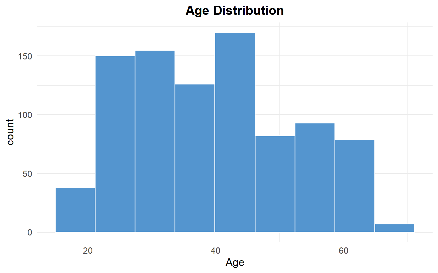
Age distribution is right skewed, with the majority of our user base falling between ages 20 to 40.

```{r}
skystream %>%
  ggplot(aes(Age)) +
  geom_histogram(
    bins = 9,
    fill = "#5495CFFF",
    color = "white"
    ) +
  labs(title = "Age Distribution") +
  theme_minimal(base_size = 14) +
  theme(
    plot.title = element_text(hjust = 0.5, face = "bold"),
    panel.grid.major.x = element_blank()
  )
```

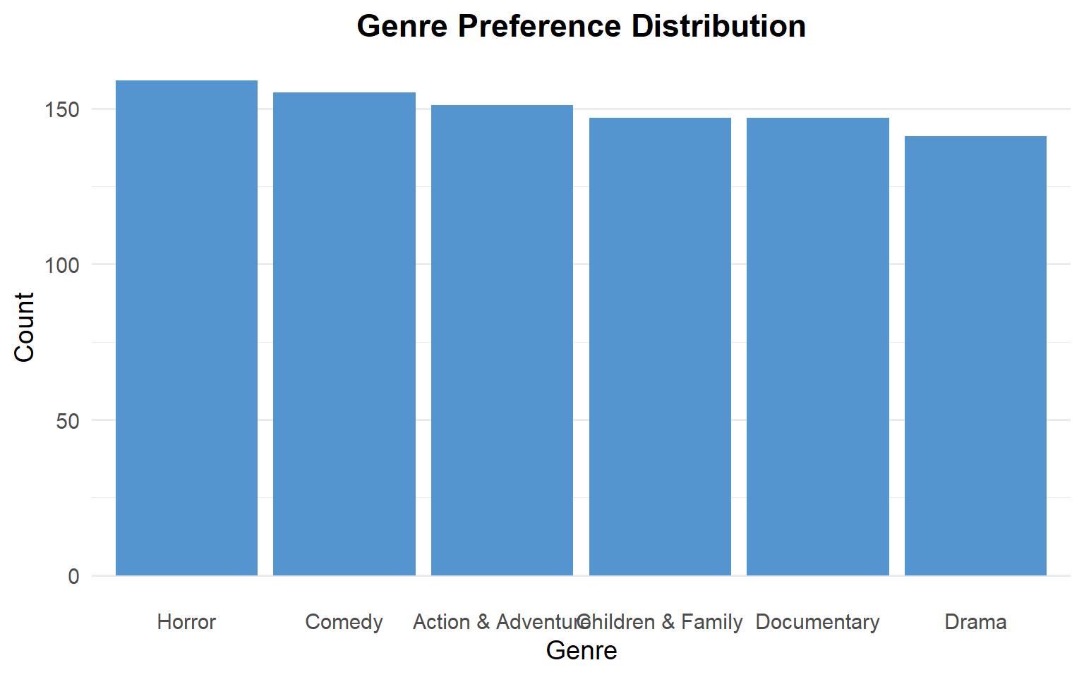
Genre preferences are quite evenly distributed within the user base.

```{r}
#| echo: false

skystream %>%
  ggplot(aes(x = fct_infreq(Genre))) +
  geom_bar(fill = "#5495CFFF") +
  labs(title = "Genre Preference Distribution", x = "Genre", y = "Count") +
  theme_minimal(base_size = 14) +
  theme(
    plot.title = element_text(hjust = 0.5, face = "bold"),
    panel.grid.major.x = element_blank()
  )
```

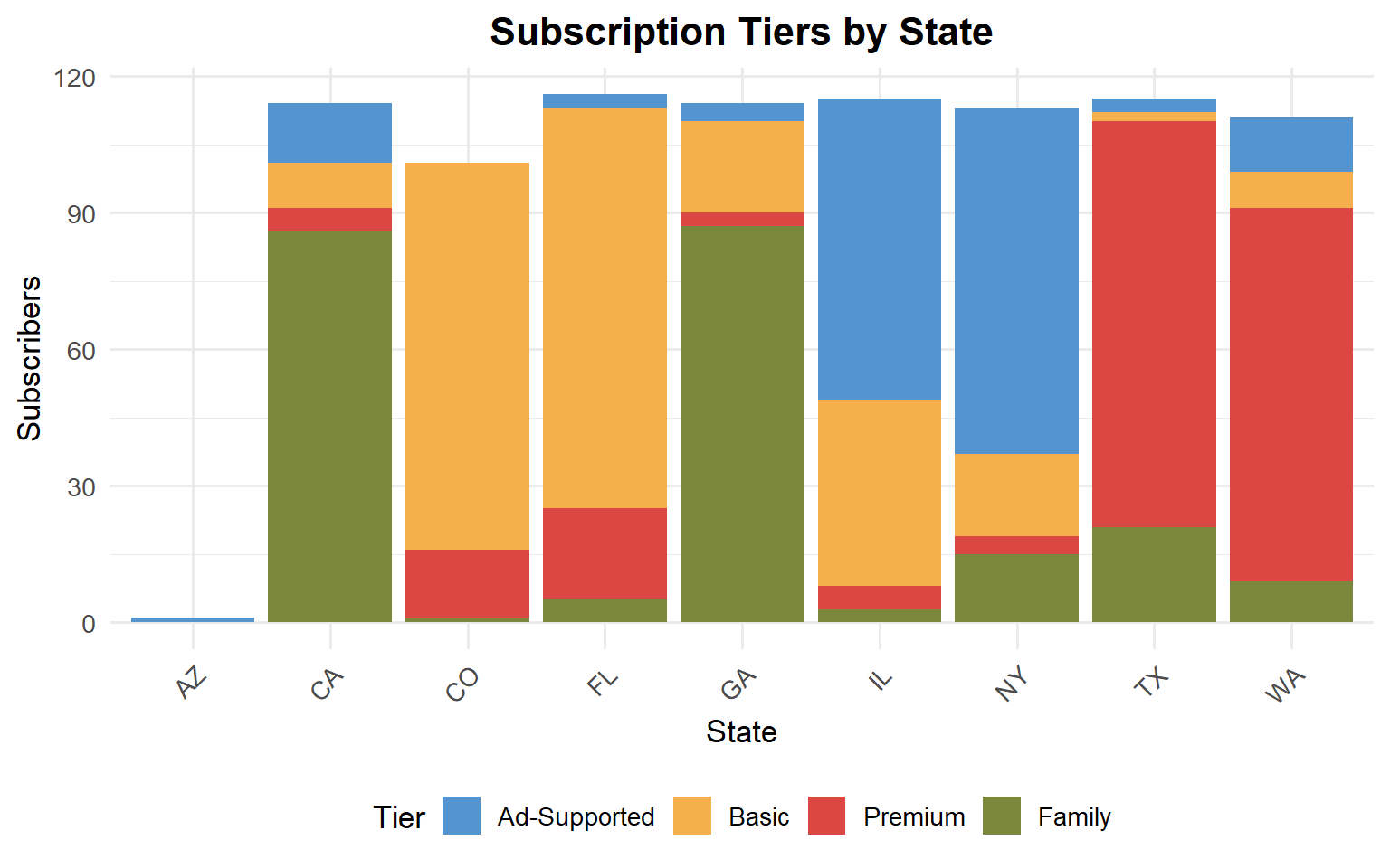
Tiers by State reveals an interesting pattern. In TX and WA, Premium tier dominates while in CA and GA the leading tier is Family. CO and FL subscribe mainly to Basic tier, and IL and NY to Ad-Supported.

```{r}
skystream %>%
  ggplot(aes(x = State, fill = SubscriptionTier)) +
  geom_bar() +
  labs(
    title = "Subscription Tiers by State",
    x = "State", y = "Subscribers", fill = "Tier"
  ) +
  theme_minimal(base_size = 13) +
    scale_fill_paletteer_d("nationalparkcolors::Badlands") +
  theme(axis.text.x = element_text(angle = 45, hjust = 1),
        legend.position = "bottom",
        plot.title = element_text(hjust = 0.5, face = "bold", size = 16))

```

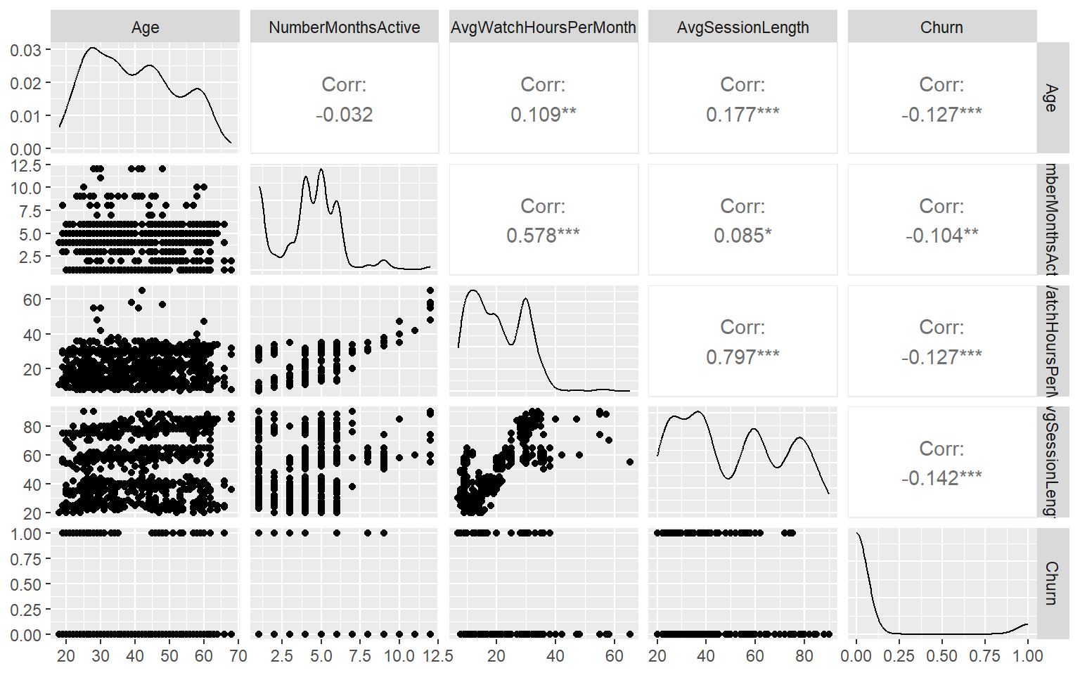
There is strong correlation between AvgWatchHoursPerMonth, AvgSessionLength, which seems logical in that users who spend more time on the platform per session, also spend more hours watching movies per month. It may also signal that increasing session duration is positive user behavior, instead of a negative behavior such as unproductive scrolling and browsing for content.

No strong correlation between continious variables and Churn.

```{r}
skystream %>%
  select(Age, NumberMonthsActive, AvgWatchHoursPerMonth, AvgSessionLength, Churn) %>%
  ggpairs()

```

No strong correlation between categorical variables and Churn.

```{r}
library(rcompanion)

cramerV(table(skystream$Churn, skystream$Gender))
cramerV(table(skystream$Churn, skystream$Genre))
cramerV(table(skystream$Churn, skystream$SubscriptionTier))

```

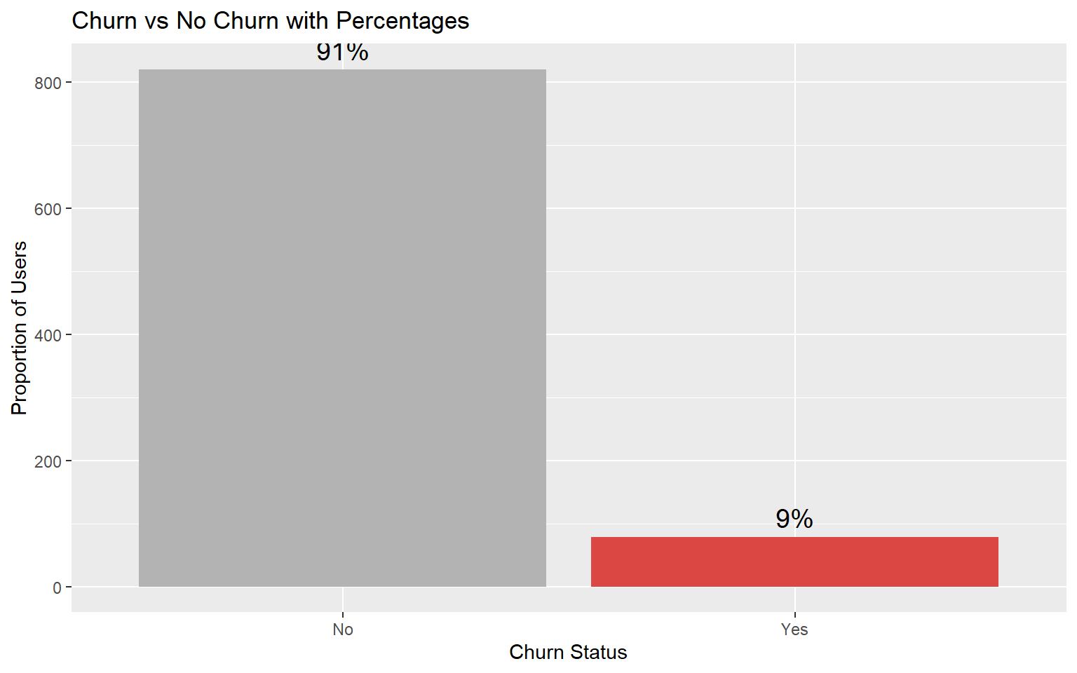
Less than 10% of users have churned, out of 900 users.

```{r}
skystream %>%
  count(Churn) %>%
  mutate(prop = n / sum(n)) %>%
  ggplot(aes(x = factor(Churn), y = n, fill = factor(Churn))) +
  geom_col() +
  geom_text(aes(label = scales::percent(prop, accuracy = 1)),
            vjust = -0.5, size = 5) +
  scale_fill_manual(values = c("0" = "grey70", "1" = "#DB4743FF")) +
  scale_x_discrete(labels = c("0" = "No", "1" = "Yes")) +
  labs(x = "Churn Status",
       y = "Proportion of Users",
       title = "Churn vs No Churn with Percentages",
       fill = "Churn") +
  guides(fill = "none")
```

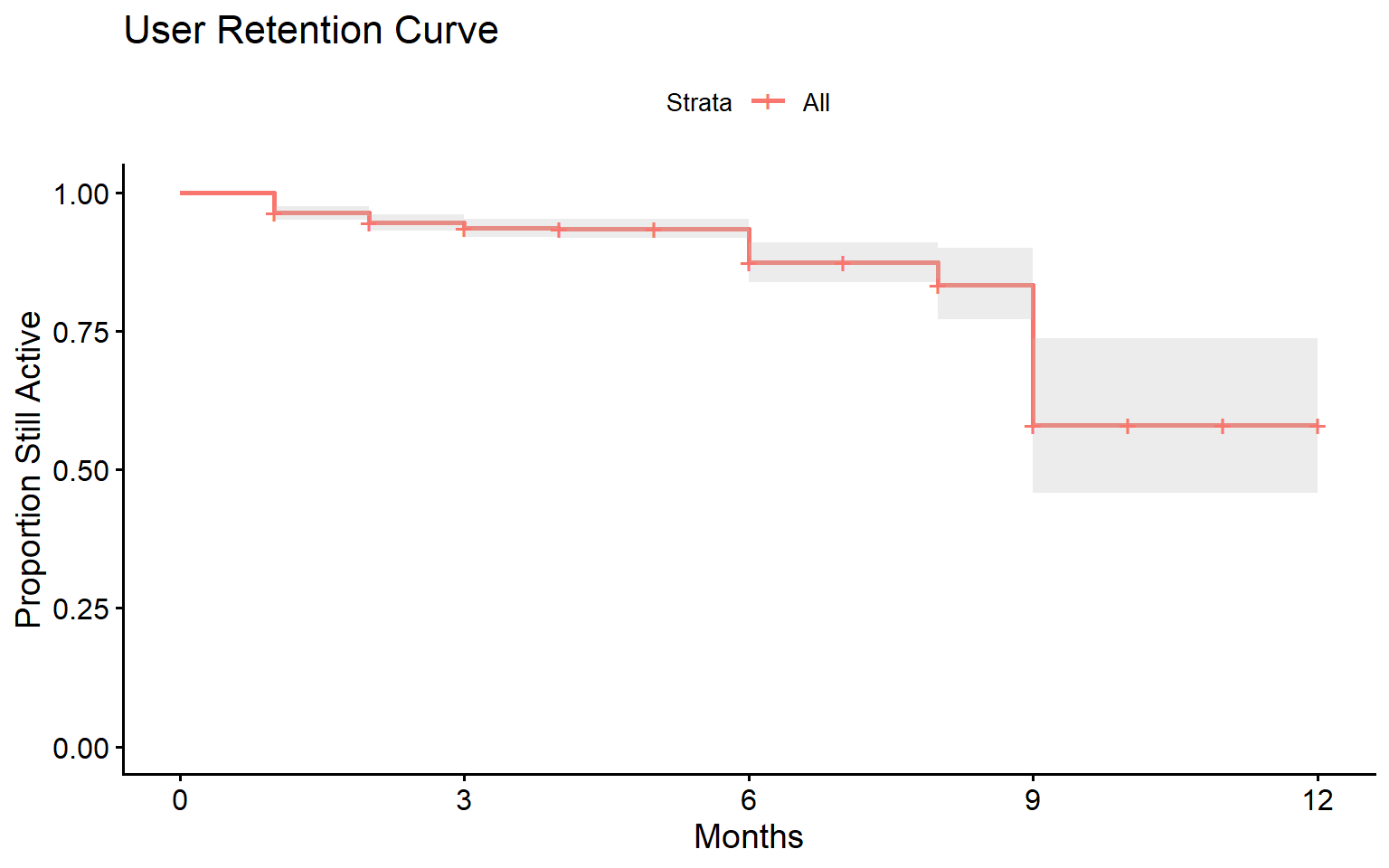
There is a significant drop among users after 9 months.

```{r}
fit <- survfit(Surv(NumberMonthsActive, Churn) ~ 1, skystream)

ggsurvplot(fit, conf.int = TRUE,
           xlab = "Months",
           ylab = "Proportion Still Active",
           title = "User Retention Curve")

```

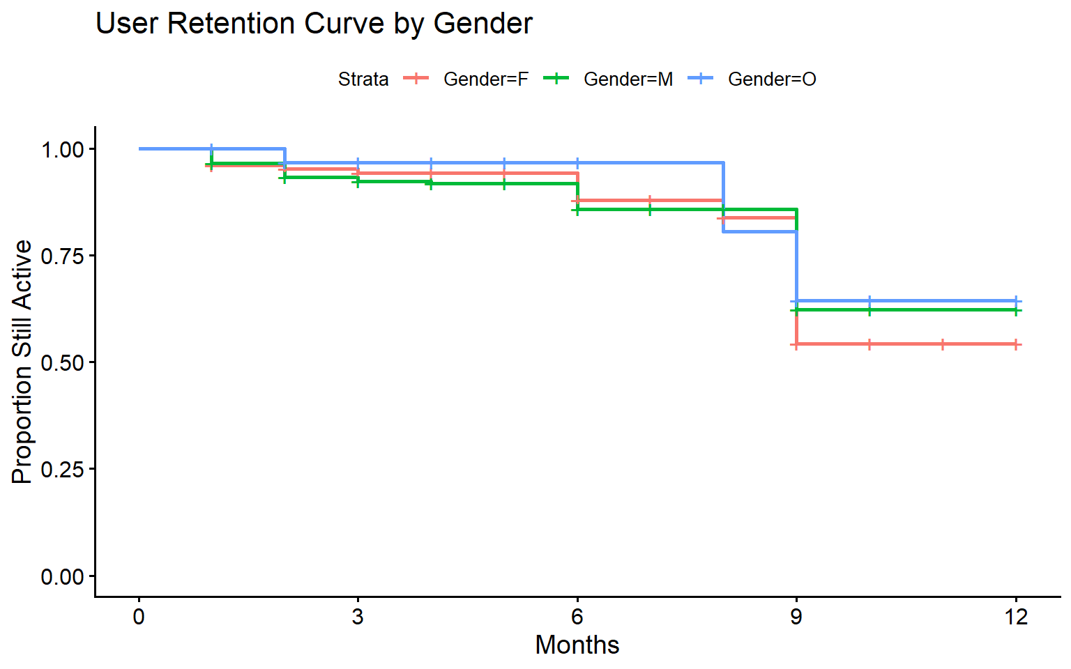
The 9 month retention is similar across genders.

```{r}
fit_gender <- survfit(Surv(NumberMonthsActive, Churn) ~ Gender, skystream)

ggsurvplot(fit_gender, skystream,
           xlab = "Months",
           ylab = "Proportion Still Active",
           title = "User Retention Curve by Gender")


```

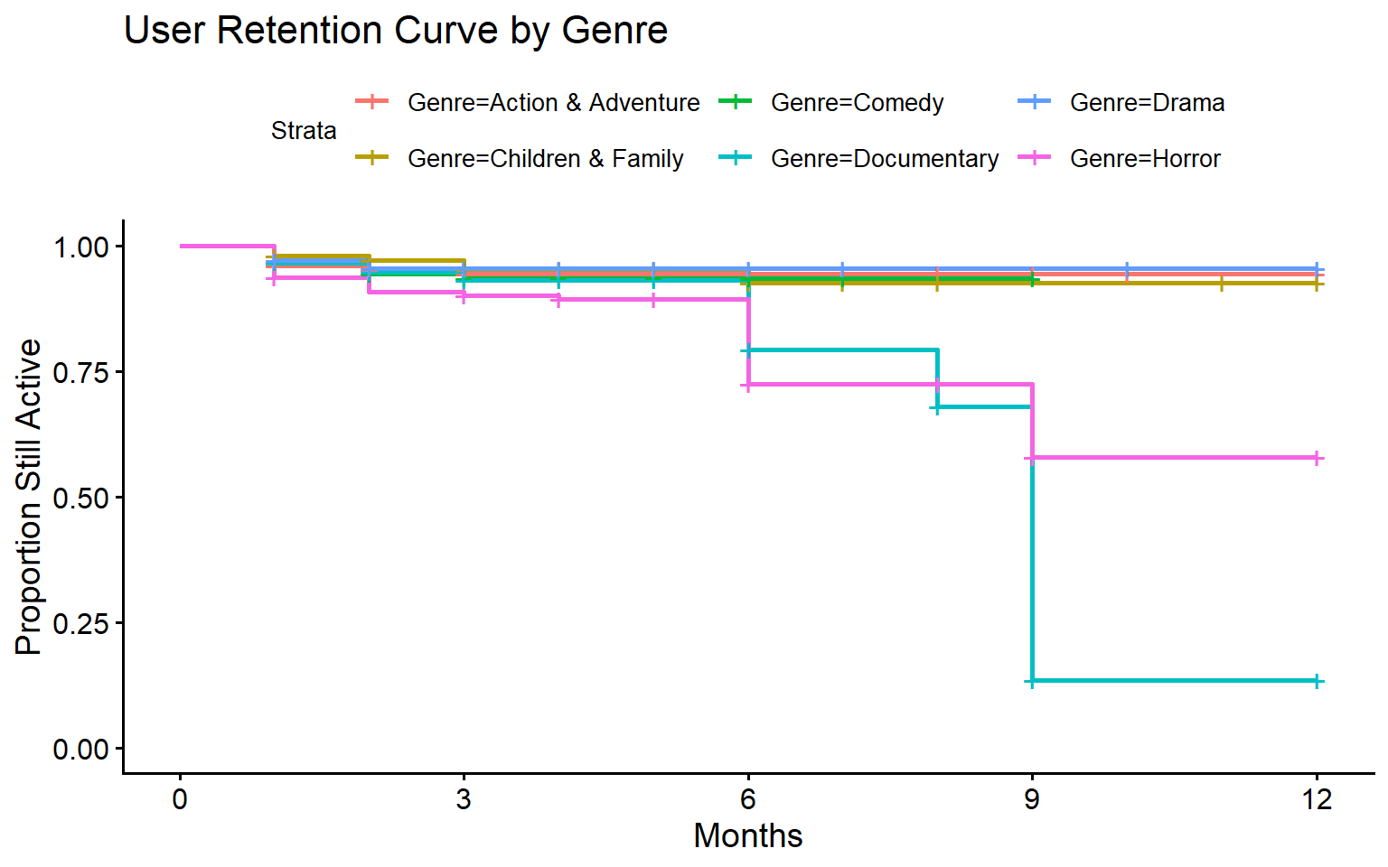
Horror and Documentary fans show significant loss in retention over time. They might be losing interest due to a lack of new content in these genres.

```{r}
fit_genre <- survfit(Surv(NumberMonthsActive, Churn) ~ Genre, skystream)

ggsurvplot(fit_genre, skystream,
           xlab = "Months",
           ylab = "Proportion Still Active",
           title = "User Retention Curve by Genre")
```

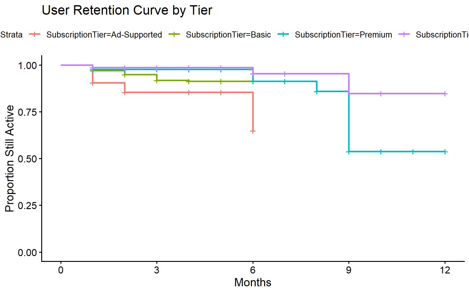
Retention is much stronger in higher tiers. Ad-supported and Basic seem to lose steam around 6 months.

```{r}
fit_tier <- survfit(Surv(NumberMonthsActive, Churn) ~ SubscriptionTier, skystream)

ggsurvplot(fit_tier, skystream,
           xlab = "Months",
           ylab = "Proportion Still Active",
           title = "User Retention Curve by Tier")
```

## Data Preparation for KNN

After initial data exploration, we prepare data for KNN. We ensure that all continuous variables are numeric and we drop the variables that we will not be using in our model. RevenueYTD is dropped as it would be reduntant when we have both SubscriptionTier and NumberMonthsActive in the model, which directly determine this 3rd variable.

We convert the Churn variable, which indicates whether a customer has churned, into a factor so it can be treated as a categorical classification outcome.

The categorical variables are recoded as dummy variables so KNN can compute distance across categories.

```{r}
# Define columns by role/type
num_cols  <- c("NumberMonthsActive", "AvgSessionLength", "Age",
               "MonthsSinceLastActivity", "AvgWatchHoursPerMonth")

cat_cols  <- c("SubscriptionTier", "Genre", "State", "Gender", "DevicePreference")

skystream_knn <- skystream %>%
  #Make “Churned” the first level so tidymodels treats Churned as the positive class
  mutate(Churn = factor(Churn, levels = c(1, 0), labels = c("Churned", "Active"))) %>%

  # Ensure numericals are numeric
   mutate(across(all_of(num_cols), as.numeric)) %>%

  # Remove columns not suitable as KNN features
  select(-CustomerID, -JoinDate, -CancelDate, -RevenueYTD) %>%

  # One-hot encode categoricals (drop first level to avoid redundancy)
  fastDummies::dummy_cols(
    select_columns = cat_cols,
    remove_first_dummy = TRUE,
    remove_selected_columns = TRUE
  ) %>%

  #Ensure column names are all in tidy format
   rename_with(~ to_any_case(., case = "upper_camel"))

```

## Creating the Model

We set the seed using set.seed() to ensure the observations are random and consistent. We use initial_split() to divide the dataset, with 80% allocated for training and 20% for testing. Then, we use the strata = churned argument to ensure the class distribution of the churned variable is kept in both the training and testing sets. Finally, we extract the datasets for training and testing using split.

```{r}
set.seed(867)
Split80 = initial_split(skystream_knn, prop = 0.80, strata = Churn)

DataTrain <- training(Split80)
DataTest  <- testing(Split80)

```

We define the recipe for preprocessing. We specify the recipe with Churn \~ ., which means all other columns, such as Age and NumberMonthsActive, will be used to predict whether a customer churned.

We use step_normalize(all_predictors()) to scale all predictor variables and ensure they are all within the same scale.

Since our 900 observation data is highly imbalanced, churned users comprising less than 10% of the user base, we use SMOTE from the themis package to create new synthetic samples of the minority class. SMOTE can create realistic "synthetic churn customers" so the KNN model doesn’t always default to predicting “Active.” It is less likely to overfit compared to naive oversampling in order to balance classes.

```{r}
Recipe = recipe(Churn ~ ., data = DataTrain) |>
  step_normalize(all_predictors()) %>%  # scale numeric features
  step_smote(Churn)# apply SMOTE to balance churn vs active

ModelDesign = nearest_neighbor(neighbors=tune()) |>
               set_engine("kknn") |>
               set_mode("classification")

TuneWFModel = workflow() |>
            add_recipe(Recipe) |>
            add_model(ModelDesign)
```

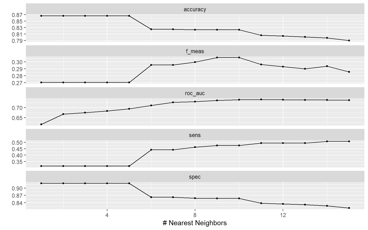
To avoid over-fitting, we are looking for the ideal number of neighbors (k) for our model to consider when classifying data points.To tune our model to the best value of *k,* we first create a hyper-parameter grid for tuning, a dataframe of possible k values (k = 1 to k = 15). For each 15 hyperparameters (k = 1 to k = 15), we will run 5 folds to cross-validate our data.

```{r}
ParGrid=data.frame(neighbors=c(1:15))

set.seed(123)
FoldsForTuning=vfold_cv(DataTrain, v=5,
                        strata=Churn)

TuneResults=tune_grid(TuneWFModel, resamples=FoldsForTuning,
                      grid=ParGrid, metrics=metric_set(roc_auc, yardstick::accuracy, sens, spec, f_meas)) #specify yardstick package to avoide conflict with rcompanion

autoplot(TuneResults)
```

After running the best hyper parameters. We went ahead and tuned the results using the metric ROC AUC, which is meant to find the balance between true positive rate and false positive rate. We want to find the optimal point where we have the highest percentage of correctly identified churn cases against the lowest number of wrongly identified active users.

Based on ROC AUC, the best value for the hyper-parameter is 11.

```{r}
BestHyperParameter=select_best(TuneResults, metric="roc_auc")

print(BestHyperParameter)
```

Based on the results of our Best Model, we see that 6 users from the data were a true positives, meaning they were correctly predicted to churn base on our variables given. We have a **35% true positive rate**.

True positive rate (also called sensitivity or recall) is the most important metric in churn prediction, given our goal is to correctly identify customers who will churn before they can do so. The model should be able to identify the highest number of churners correctly out of all those who actually end up churning churn.

This model was able to identify only 35% of the churners, and the precision is very low. **Out of all the users model predicts will churn, only 20% actually churn**, the number of false positives is very high. This could lead to an inefficient allocation of the retention budget.

```{r}
WFModelBest=TuneWFModel |>
  finalize_workflow(BestHyperParameter) |>
  fit(DataTrain)

PredictionBestModel=augment(WFModelBest, DataTest)

cm <- conf_mat(PredictionBestModel, truth=Churn,
         estimate=.pred_class)

cm

cm %>% summary()
```

We need to refine our model further to get the best results out of KNN.

## Refining the Model

### Hyperparameter Grid

Hyperparameter grids with k = \[1:30\] and k = \[1:60\] were also tested, which gave k = 11 (same as k = 15) and k = 43 as best hyperparameters. When k = 43 was used to tune the model, recall increased but precision dropped further.

As a result, we maintain k = 11 as a balanced hyperparameter, that also uses less computational power.

### Thresholds

As we have an imbalanced data set, we tuned our hyperparameter to ROC AUC, settling on the k with the highest AUC. ROC AUC trains our model to be good at ranking positives ahead of negatives regardless of the threshold.

Now we can move on to determining the best threshold to balance recall and precision.

We will scan a range of thresholds and pick the threshold that maximizes F1.

```{r}
# Try thresholds from 0.05 to 0.95
ths <- seq(0.05, 0.95, by = 0.01)

scan_f1 <- map_dfr(ths, function(t) {
  cls <- factor(
    ifelse(PredictionBestModel$.pred_Churned >= t, "Churned", "Active"),
    levels = c("Churned","Active")
  )
  tibble(
    threshold = t,
    f1 = f_meas_vec(PredictionBestModel$Churn, cls, beta = 1),
    precision = precision_vec(PredictionBestModel$Churn, cls),
    recall = sens_vec(PredictionBestModel$Churn, cls)
  )
})

# Show the best threshold by F1
best_thresh_f1 <- scan_f1 %>%
  slice_max(f1, n = 1) %>%
  pull(threshold)

best_thresh_f1

```

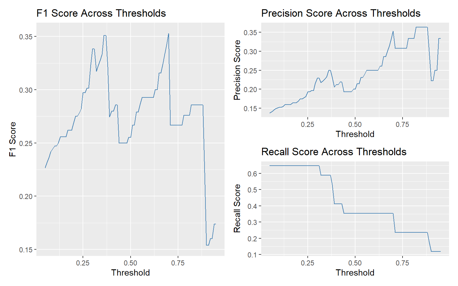
It appears that F1 peaks around t = 0.70. This increases our precision significantly while decreasing our recall.

```{r}
f1_plot <- ggplot(scan_f1, aes(x = threshold, y = f1)) +
  geom_line(color = "steelblue") +
  labs(title = "F1 Score Across Thresholds", y = "F1 Score", x = "Threshold")

 f1_plot2 <- ggplot(scan_f1, aes(x = threshold, y = precision)) +
  geom_line(color = "steelblue") +
  labs(title = "Precision Score Across Thresholds", y = "Precision Score", x = "Threshold")

 f1_plot3 <- ggplot(scan_f1, aes(x = threshold, y = recall)) +
  geom_line(color = "steelblue") +
  labs(title = "Recall Score Across Thresholds", y = "Recall Score", x = "Threshold")


 f1_plot | (f1_plot2 / f1_plot3)
```

Using 0.70 as a threshold, we achieve a more balanced model compared to the default threshold of 0.5, which we got after tuning our model for ROC AUC.

Precision is now at 0.35, and recall at 0.35.

```{r}
PredictionBestModel_f1 <- PredictionBestModel %>%
  mutate(
    .pred_class_opt = factor(
      ifelse(.pred_Churned >= best_thresh_f1, "Churned", "Active"),
      levels = c("Churned","Active")
    )
  )

cm_f1 <- conf_mat(PredictionBestModel_f1, truth = Churn, estimate = .pred_class_opt)

cm_f1

cm_f1 %>%
  summary()
```

**Compared to the previous model,** **this model is better at eliminating false churn cases**. However, we are also missing out on more true positives due to the increased threshold for churn prediction.

```{r}
cm_f1
cm
```

We will refine further by changing weights.

### Inverse Distance Weighting

In our initial KNN model design, every neighbor were counted equally by default (weight_func = "rectangular"). This only takes into account the class of nearby points when predicting, ignoring distance. Inverse distance weighting ("inv") makes KNN more sensitive to local structure, reducing the impact of “distant” neighbors by giving neighbors closer to the query point higher weight.

Simply using IDW with ROC, yielded higher recall than our first model.

```{r}
ModelDesign_inv=nearest_neighbor(neighbors=tune(), weight_func = "inv") |>
               set_engine("kknn") |>
               set_mode("classification")

TuneWFModel_inv=workflow() |>
            add_recipe(Recipe) |>
            add_model(ModelDesign_inv)

ParGrid=data.frame(neighbors=c(1:15))

set.seed(123)
FoldsForTuning=vfold_cv(DataTrain, v=5,
                        strata=Churn)

TuneResults_inv=tune_grid(TuneWFModel_inv, resamples=FoldsForTuning,
                      grid=ParGrid, metrics=metric_set(roc_auc, yardstick::accuracy, sens, spec, f_meas))

BestHyperParameter_inv=select_best(TuneResults_inv, metric="roc_auc")

WFModelBest_inv=TuneWFModel_inv |>
  finalize_workflow(BestHyperParameter_inv) |>
  fit(DataTrain)

PredictionBestModel_inv=augment(WFModelBest_inv, DataTest)

cm_inv <- conf_mat(PredictionBestModel_inv, truth=Churn,
         estimate=.pred_class)

cm_inv

cm_inv %>%
  summary()


```

Setting the threshold to 0.70, again increased precision but decreased recall.

```{r}
scan_f1_inv <- map_dfr(ths, function(t) {
  cls <- factor(
    ifelse(PredictionBestModel_inv$.pred_Churned >= t, "Churned", "Active"),
    levels = c("Churned","Active")
  )
  tibble(
    threshold = t,
    f1 = f_meas_vec(PredictionBestModel_inv$Churn, cls, beta = 1),
    precision = precision_vec(PredictionBestModel_inv$Churn, cls),
    recall = sens_vec(PredictionBestModel_inv$Churn, cls)
  )
})

best_thresh_f1_inv <- scan_f1_inv %>% # Show the best threshold by F1
  slice_max(f1, n = 1) %>%
  pull(threshold)

PredictionBestModel_f1_inv <- PredictionBestModel_inv %>%
  mutate(
    .pred_class_opt = factor(
      ifelse(.pred_Churned >= best_thresh_f1_inv, "Churned", "Active"),
      levels = c("Churned","Active")
    )
  )

cm_inv_f1 <- conf_mat(PredictionBestModel_f1_inv, truth = Churn, estimate = .pred_class_opt)

cm_inv_f1

cm_inv_f1 %>%
  summary()
```

### Manhattan Distance Weighting

Our previous models used Euclidean distance by default (dist_power = 2), which is sensitive to large differences in any single feature since squaring exaggerates outliers.

We can change this to Manhattan distance, which is more robust to high-dimensional and sparse data (like one-hot encoded variables), since it just adds absolute differences without squaring them.

Our dataset has lots of dummy variables and scaled numerics. Therefore, we may set our argument to favor Manhattan (dist_power = 1) to treat all feature differences more evenly.

Even without optimized for F1 score, Manhattan Distance Weighting gives us the highest recall and precision we obtained so far.

```{r}
ModelDesign_man=nearest_neighbor(neighbors=tune(), weight_func = "inv", dist_power = 1) |>
               set_engine("kknn") |>
               set_mode("classification")

TuneWFModel_man=workflow() |>
            add_recipe(Recipe) |>
            add_model(ModelDesign_man)

ParGrid=data.frame(neighbors=c(1:15))


set.seed(123)
FoldsForTuning=vfold_cv(DataTrain, v=5,
                        strata=Churn)

TuneResults_man=tune_grid(TuneWFModel_man, resamples=FoldsForTuning,
                      grid=ParGrid, metrics=metric_set(roc_auc, yardstick::accuracy, sens, spec, f_meas))

BestHyperParameter_man=select_best(TuneResults_man, metric="roc_auc")

WFModelBest_man=TuneWFModel_man |>
  finalize_workflow(BestHyperParameter_man) |>
  fit(DataTrain)

PredictionBestModel_man=augment(WFModelBest_man, DataTest)

cm_man <- conf_mat(PredictionBestModel_man, truth=Churn,
         estimate=.pred_class)

cm_man

cm_man %>%
  summary()

```

After optimizing for the F1 score, we **achieved 47% recall with 57% precision.**

```{r}
# Show the best threshold by F1
scan_f1_man <- map_dfr(ths, function(t) {
  cls <- factor(
    ifelse(PredictionBestModel_man$.pred_Churned >= t, "Churned", "Active"),
    levels = c("Churned","Active")
  )
  tibble(
    threshold = t,
    f1 = f_meas_vec(PredictionBestModel_man$Churn, cls, beta = 1),
    precision = precision_vec(PredictionBestModel_man$Churn, cls),
    recall = sens_vec(PredictionBestModel_man$Churn, cls)
  )
})

best_thresh_f1_man <- scan_f1_man %>% # Show the best threshold by F1
  slice_max(f1, n = 1) %>%
  pull(threshold)

best_thresh_f1_man

PredictionBestModel_f1_man <- PredictionBestModel_man %>%
  mutate(
    .pred_class_opt = factor(
      ifelse(.pred_Churned >= best_thresh_f1_man, "Churned", "Active"),
      levels = c("Churned","Active")
    )
  )

cm_man_f1 <- conf_mat(PredictionBestModel_f1_man, truth = Churn, estimate = .pred_class_opt)

cm_man_f1 %>%
  summary()
```

## Conclusion

Our final KNN model predicts 47% of all churn cases correctly with 57% precision.

```{r}
cm_man_f1

cm_man_f1 %>%
  summary()
```

Through several optimizations, we transformed KNN into a model that provides practical business value for churn prediction. The initial version, using Euclidean distance and equal neighbor weighting, was prone to misclassifying churners because the majority “Active” class dominated.

By introducing **inverse distance weighting**, the model became more sensitive to customers whose behavior closely resembled churners, improving its ability to detect at-risk users. Switching to **Manhattan distance** further improved results by better handling the many categorical (dummy) features in our dataset, allowing the model to differentiate churners more effectively. Finally, instead of relying on the default 0.5 probability cutoff, we optimized the **decision threshold** for the F1 score, which balanced the need to catch more churners (recall) with the need to reduce false alarms (precision).

Together, these changes yielded a model that can more reliably flag customers with genuine churn risk, enabling more targeted and cost-effective retention campaigns.

### Next Steps

Looking ahead, we recommend benchmarking this improved KNN against **tree-based methods such as Random Forest**. These algorithms often outperform KNN on imbalanced, high-dimensional data and may further increase recall without sacrificing precision. Incorporating **cost-sensitive evaluation** (penalizing missed churns more heavily) and **feature engineering** to capture behavioral trends (e.g., declining engagement over time) would also align the modeling process more closely with business objectives. This will ensure that our churn detection framework continues to evolve into a robust, actionable tool for customer retention strategy.